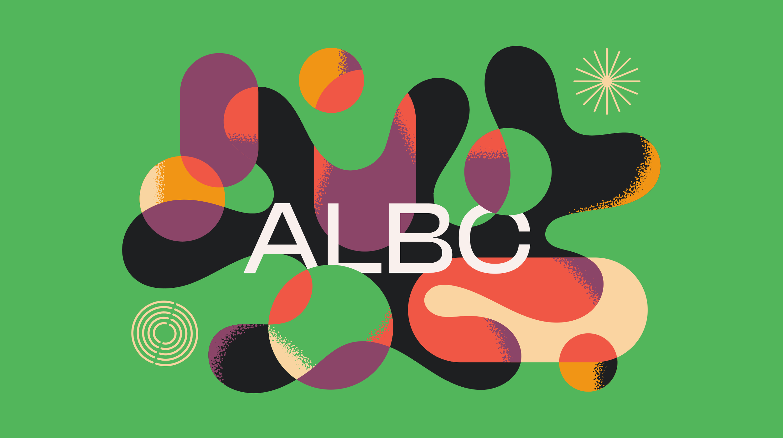
A Little Better Co
While the agency already had creative components, they needed a fresh perspective to bring cohesion, clarity, and an elevated creative expression to their visual identity. My role was to make sense of the elements by distilling what was working, identifying gaps, and ensuring that every visual element aligned with the brand’s mission and values. From typography and color palettes to layout systems and graphic treatments, the identity was pushed further to feel not only consistent but also bold, engaging, and unmistakably aligned with the brand’s purpose.


